
The image below shows the volume and direction of passenger traffic between IZABU town and its surrounding towns in the year 2001.
Scale: 1 line represents 1,500 persons
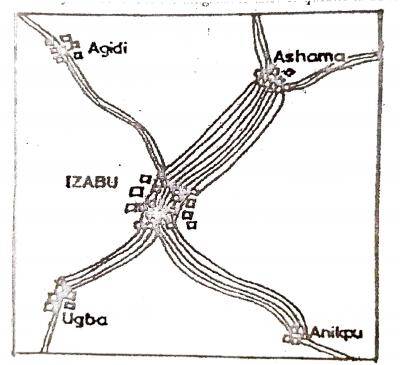
A. Dot map
B. Isohaline map
C. Flow chart
D. Bar chart
Correct Answer:
Option C = Flow chart